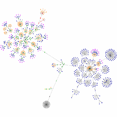
This graphic was created by a cool java applet that traverses a web site and translates it into its various components. That information is then rendered in this format. In less than specific biological terms, it’s the phylogeny of my site.
That gray ball with the black center shown at the bottom is the very top of the page (the header), then the cluster on the left is all of the post data and the cluster on the right is the sidebar data. Very cool, if not a bit nerdy. One of the neatest aspects of this is to watch it form as the applet builds the representation of a site.
What do the colors mean?
blue: for links (the A tag)
red: for tables (TABLE, TR and TD tags)
green: for the DIV tag
violet: for images (the IMG tag)
yellow: for forms (FORM, INPUT, TEXTAREA, SELECT and OPTION tags)
orange: for linebreaks and blockquotes (BR, P, and BLOCKQUOTE tags)
black: the HTML tag, the root node
gray: all other tags
[via PZ]
Related

Today, May 22, 2010, is the International Day for Biological Diversity. I began this post with the idea of celebrating the day by offering various examples of nature's beauty. But then I realized 'celebrate' connotes a positive meaning that hardly seems appropriate. Why? This year the International Day of Biological…
May 22, 2010
In "Nature Photos"
From SPACE.com: A galaxy in Stephan's Quintet is rushing headlong into a cluster of neighboring galaxies at more than one million mph and generating one of the largest shock waves scientists have ever seen. The finding, made using NASA’s Spitzer Space Telescope, gives astronomers a chance to see a galactic…
March 8, 2006
Similar post
I apologize for the brief site outage this morning. A combination of events caused it. I began several updates to Apache and other server components around 11 a.m. CST. My TTY session was buzzing along nicely when suddenly it froze—right in the middle of the Apache updates. After giving it…
January 3, 2007
With 13 comments

